
Windows 11 preview here
1. Lock screen interface
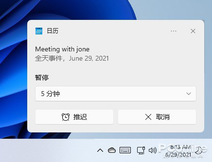
The lock screen change was not mentioned at the press conference. The new version of the lock screen looks like a mobile phone, with the time and date displayed in the middle, and is no longer located in the lower left corner of the screen like Windows 10. Instead of using Microsoft Yahei, the font is replaced with a brand new bracket text. The schedule alarm is still displayed on the lock screen, but it cannot be opened directly by tapping on it like on a mobile phone.
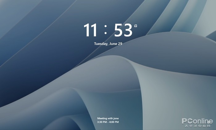
New version of the lock screen interface
In terms of settings, previous Windows 10 could customize display content and support multiple sets of information. The new version of the lock screen can only choose one of three options between calendar, mail, and weather, and no other apps can be added. In the new version, you can still see some sections that have not completed the UI conversion yet, but they are not as clear as Windows 10.
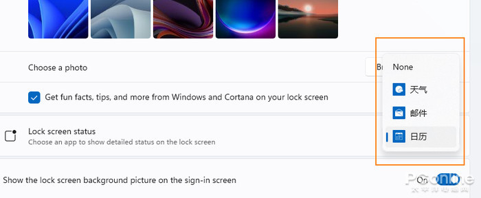
No longer supports custom display of information
There are still sections with incomplete UI conversion
2. Start Menu
The start menu is compatible with the leaked version, and there is no top search bar. The entire menu is divided into three parts: upper / middle / lower, corresponding to applications, recommended menus, and commonly used commands. Like the press conference, the recommended list here also consists of the most used apps, recently added apps, and files that were just used. A more detailed list can be found through the “More>” button. In addition, after the user clicks Settings -> Personalization -> Start, he can select the region display content himself, which is the same as Windows 10.
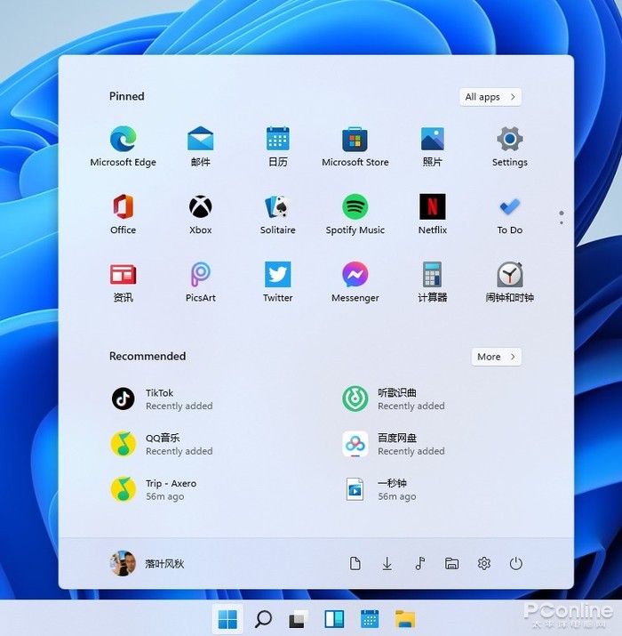
start menu
Frequently used commands can be added from the settings panel, support right-click to quickly add and delete. Like the leaked version, a temporary menu pops up after right-clicking the start icon, and users can use it to invoke modules like Task Manager, Run, and Windows Terminal. The taskbar supports left positioning, and users who are not used to centering can go back to Windows 10 style, reducing learning costs.

Right-click to quickly add and delete shortcut commands
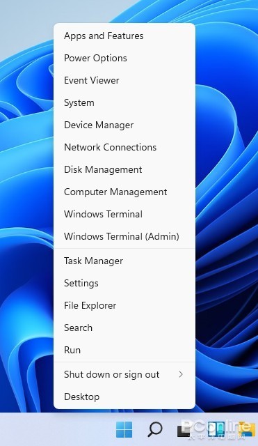
Right-click on the temporary menu
3. Tools
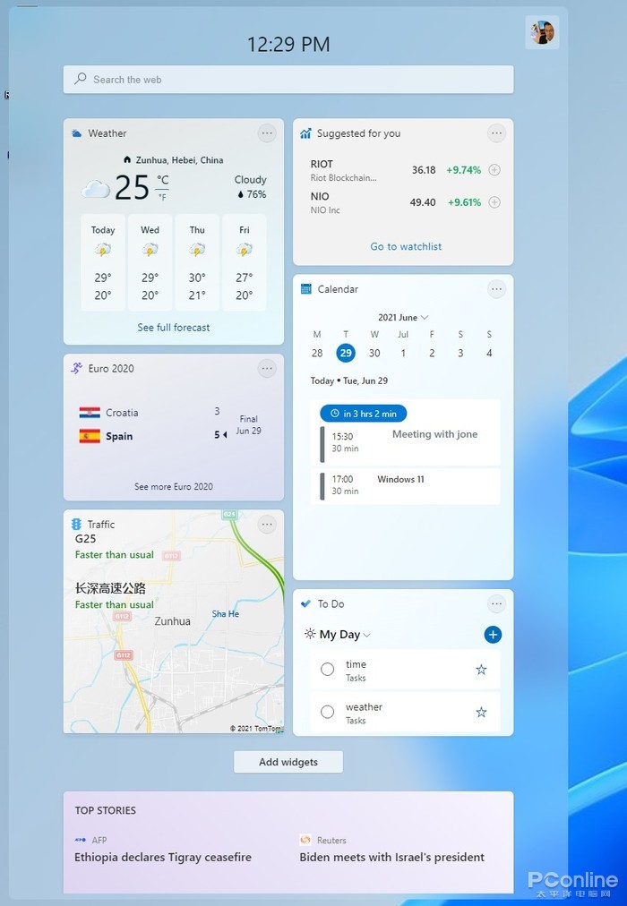
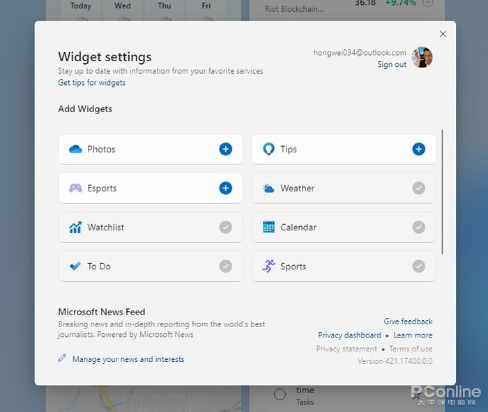
The widgets have added a search bar and manual add and delete functions to the widgets, and you can now almost find the weather, inventories, traffic and schedule mentioned in the press conference. The tools support three sizes small / medium / large and can be pulled out to adjust the position. Some functions can be run directly in the interface, such as creating tables, querying stocks, etc.
small tools
Compared to UWP-supported tiles, the tools data all come from the Internet. So, even if it’s photos, it opens OneDrive (online version) after clicking on it. At the moment, there are only a few official pre-made tools to choose from, and the number is not very rich.
The number of gadgets is still relatively small
In addition to efficiency tools, news tools have also added interactive features. Click “Like” to like information, and click icons to connect with Internet users. On the right side of the panel is the menu of commands, which provides functions such as reducing recommendations and one-click sharing. In addition, it also presets “Read Later”, you can collect important information and read it together.
4. Settings panel
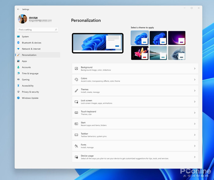
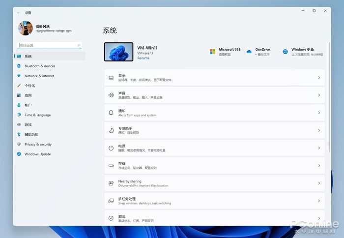
The setup panel adopts a left-to-right layout, the biggest advantage is that no matter where you are, you can quickly go to the desired unit. However, compared to the press conference footage, the current version has fewer special effects than “frosted glass”, and the quality feel is much worse.
New version settings panel
The second level module uses the layout logic in Windows 10, but the Terminal page is replaced with a more concise button style. It is noteworthy that, in addition to the left menu, the top tab bar also has a transition function, which is in fact similar to the title bar, which is very effective in actual use.

Changes details
The new version does not add new features, but it has reclassified existing features. Compared with the previous version, the Modules section of the new version is more organized, and it is also more convenient for Windows 10 users to get started. The classic panel entry appears less in Windows 11, like the previous power management panel, which is no longer present in the new version.

Project view has been improved to make it look more organized
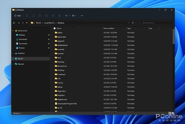
5. File Explorer
File Explorer enables a new design, eliminates the top bar panel, and fixes commonly used commands on the toolbar in the form of icons. When different objects are selected, the corresponding icons will light up to remind the user of effective operations.
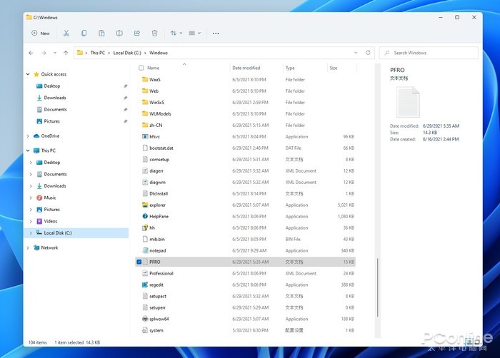
New version of file explorer
Thanks to the new arrangement, the new version of File Explorer replaces all previous functions with just a few icons. The rarely used functions are hidden in “…” and can be seen by clicking on the button. On the one hand, the new design ensures the simplicity of the panel, and on the other hand, it does not lose the superiority of Windows Explorer, which is a relatively perfect result.
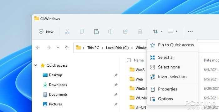
New version of the Button Toolbar
The new resource manager supports two modes of loose/compressed, compatible with tablet users and keyboard and mouse users respectively. The right-click menu enables the new user interface. In addition to the greater spacing between positions, one of the most obvious changes is the replacement of the four functions of cut, copy, rename, and delete with icons (familiar! Think of Office).
In the menu content, several groups of commands have been added, ZIP file compression, copy as path, open in Windows terminal, and the list of third-party programs is automatically blocked. If users have access requirements, they can click Show More Options to visit separately.
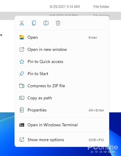
New version of the right-click menu
The desktop menu has also been replaced by a new user interface, but there is a small problem – the “Update” has disappeared. At the moment, Microsoft does not have an explanation for this, and fortunately, the F5 key is still effective, after all, you usually use this function quite often.
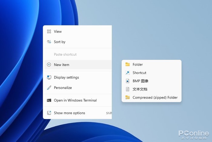
Desktop right-click menu is missing “Refresh”
Compared to the traditional resource manager, the new resource manager performs a little better in a dark environment, but the icon color is still very impressive. The newly added toolbar is also generally dark, which is not much recognizable in actual use. In addition, there is still a problem, the entire facade lacks “floor glass”, and the overall feeling of high level is insufficient.
Night mode works fine
6. Operation center and media center
Notification Center uses a separate user interface and is no longer associated with Play Center. The calendar panel provides a foldable function to reserve more space for the notification area. In addition to appearance changes, the new version also adds operable buttons for some panels. For example, an app that has just been updated can be opened directly or pinned to the start menu.

Media center division
The play center appears independently, the previous network buttons and the volume buttons belong to the same hot area. Regardless of which area is clicked, an entire operations center can be called up. The volume slider and brightness slider have been fixed at the bottom of the panel, which is more convenient than Windows 10. If the audio-visual program (UWP only) is turned on, a mini panel will appear at the top to facilitate operations such as play/pause, forward, and rewind.
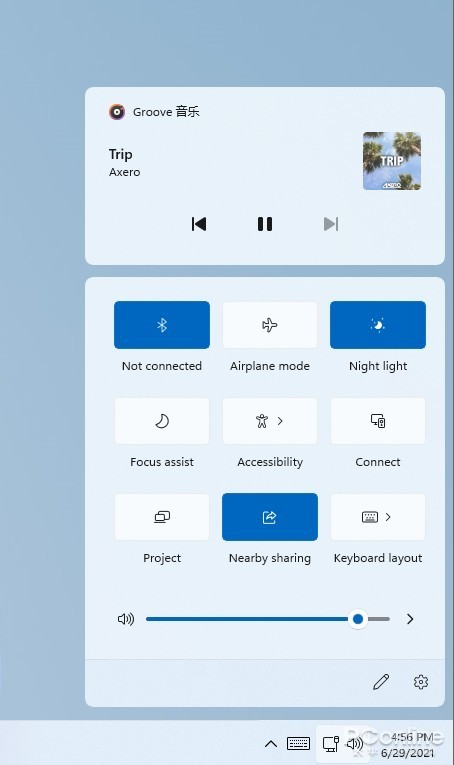
New Operations Center
7. Skin the virtual keyboard
The virtual keyboard has the function of changing the skin, in addition to the default light/dark color, there are also many new themes included. The size adjustment is a bright spot, and it wasn’t discussed at the previous press conference. But at the moment, it can only be controlled via the slider, so the convenience is average. A one-handed keyboard is a good idea, as it can meet the needs of some special scenes, but it lacks the nine-square style and is not always friendly to the Chinese.
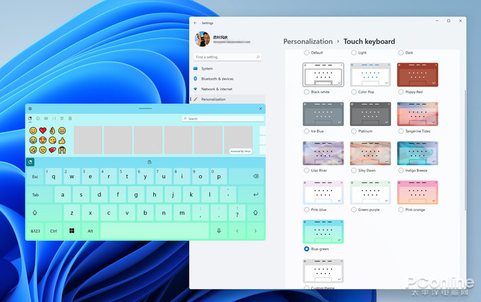
Virtual keyboard support themes

Adjust keyboard and keyboard size with one hand
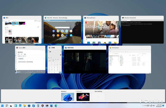
8. Virtual Desktop
Compared to Windows 10, the virtual desktop has a lower timeline (timeline), an independent wallpaper and a lower toggle bar are added. However, the design of the appearance is far from the press conference, and it is almost the difference between the mass production version and the concept version. The new version does not have a drag and drop feature across windows like macOS, and the right-click menu is still required to move windows, which is still not as convenient as a Mac.
virtual desktop
In terms of multi-monitors, I focused on testing window memory and layout capabilities. In line with the press conference, Windows 11 can automatically remember the window layout for each screen. And after reconnecting the screen, it will automatically go back to the previous mode.
After the external monitor is reconnected, the previous window layout can be restored automatically
9. App Store
Compared to Windows 10, the App Store has changed a lot, and the appearance is very close to the release conference release. The biggest impression the new version left me is the super fast screenshot rendering speed. If you don’t see the lag, you can open it to view the screenshot. In addition, the download speed is also greatly improved, and many programs can be easily run at full speed. In terms of experience, the new version is at least one step ahead of the old version.
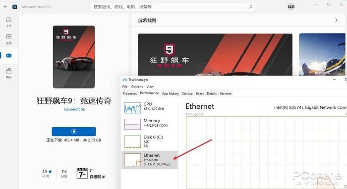
Significantly increased store speed
In terms of content, the Store currently only provides apps, games, and movies (regional settings have been modified to US). The legendary Android sub-forum did not appear, I also tried another magic operation by double-clicking on the APK file, but it also had no result.
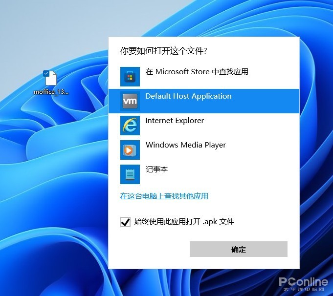
Not only is it not on the App Store, but the legendary “double-click on APK” is unresponsive.
App updates and downloads have been moved to the lower left corner. The basic functions are the same as in Windows 10, except that the progress bar has changed a bit. Below is the software you previously purchased or downloaded. Although it is similar to Windows 10, it seems easier to understand.
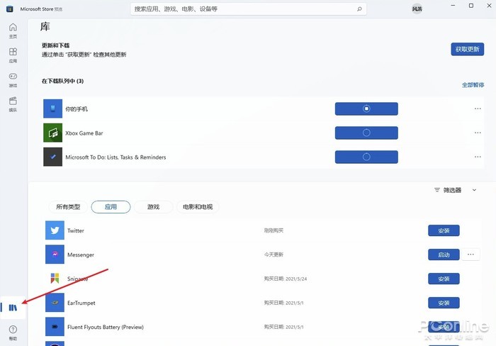
Update and download the app
10. Other changes
Other places have not changed much, such as the multitasking layout, which is the same as the previous version that was leaked. Microsoft Teams hasn’t been added to this version yet, and it’s temporarily unavailable. Some functional modules still retain the traditional look, such as device manager, backup, task manager, control panel, etc. The dictation module (Win + H) uses a new toolbar for the first time, which looks more concise. As for the other built-in apps, most are still the same in Windows 10, and there are no tweaks.
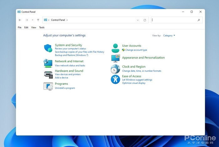
traditional control panel
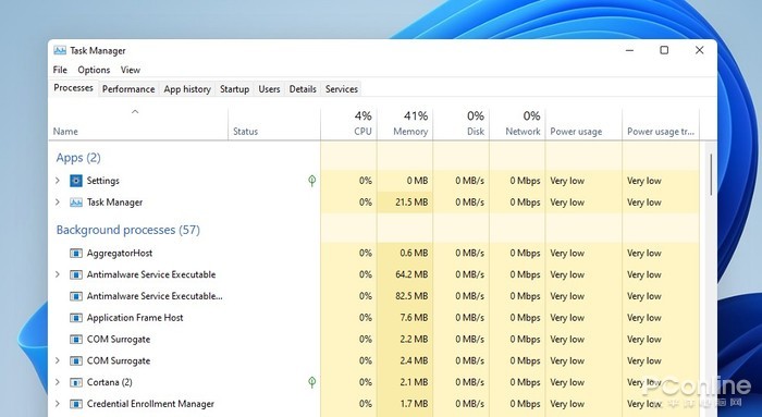
Task Manager

New dictation toolbar
Evaluation
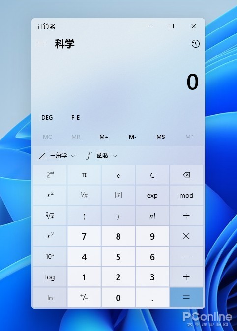
calculator
Floating notification panel

File Transfer Panel
Here is a special talk about the Chinese issue.. Like the leaked version.. This upgrade is still in the English version. But the official Chinese package is really quite powerful, it basically covers most of the areas like start menu, settings, file explorer, launch center, notification center, tools, etc. It’s perfectly fine to use it as a half-chinese version.
High degree of Christianization
write at the end
In general, the changes this time around are quite comprehensive, and the entire design style of Windows 11 tends to be more youthful. Regardless of the interface or the logic of the operation, there is a clear sense of modernity. As the first preview version, this version is also improved, basically there are no obvious freezes or crashes, most programs can be installed and run normally.
Windows 11 is here, are you looking forward to it?
However, as mentioned above, the new version still has room for improvement in the user interface. In particular, individual modules (such as File Explorer) do not work well in dark mode. On the other hand, the actual effects of “Settings” and “Resource Management” also have a certain gap in the press conference, and in general, the “high-level feeling” is not present. However, the disadvantages do not hide the advantages, from the general performance, the new version is still very satisfactory. So like Windows 11, are you looking forward to it?