A Strategic Shift Toward an Integrated Airline Ecosystem
Lufthansa Group has unveiled a comprehensive new brand identity designed to underscore its evolution from a collection of individual carriers into a fully integrated global airline group. Announced in Cologne, the update applies to Lufthansa (LH), SWISS (LX), Austrian Airlines (OS), Brussels Airlines (SN), Discover Airlines (4Y), Eurowings (EW), and other affiliated airlines.
Executives said the redesign aims to present a more cohesive visual language across the Group and help passengers better understand the connection between its various carriers. The move is one of the most significant branding shifts the company has undertaken in recent years.
Modernized Crane and Streamlined Visual Language
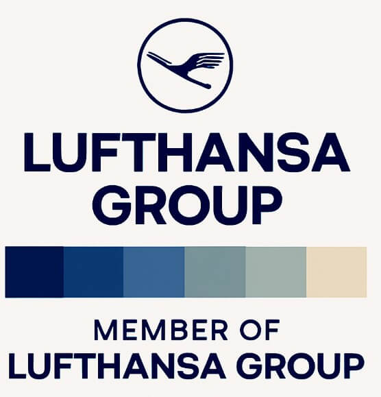
At the center of the overhaul is a refreshed version of the Group’s iconic crane. The symbol will now appear without its traditional surrounding circle, creating what the company describes as a cleaner, more contemporary mark optimized for both digital and physical environments.
The Group also introduced a modernized typeface while retaining the historic practice of spelling “Lufthansa Group” in all capital letters. A revamped color palette adds six new tones representing “different heights from the ground to the sky,” replacing the colder dark blue and gray scheme previously in use.
The expanded palette is intended to create a warmer, more engaging visual experience and strengthen the relationship between the airlines while preserving each brand’s individual character.
Group-Wide Rollout Through 2026
Implementation of the new identity begins immediately, with broad adoption scheduled for 2026. A key component of the rollout is the introduction of the “Member of Lufthansa Group” endorsement on all aircraft operated by Group airlines. The addition is meant to highlight the unified umbrella under which the brands operate.
According to the company, the endorsement reflects a broader strategic intent to bundle services more clearly and simplify the customer journey through consistent branding across touchpoints.
“The update is more than a redesign and acts as a visual anchor in a challenging environment,” said Dieter Vranckx, Chief Commercial Officer of Lufthansa Group. He noted that the redesign reinforces the Group’s brand values, supports its promise to passengers, and strengthens identification with the Lufthansa Group.
Expanded Presence Across Airports and Lounges
Passengers will begin seeing the updated look at airports and onboard aircraft as the rollout progresses. Lounge entrances will adopt the refreshed branding globally by 2026, following early implementation in Rome, Milan, and Brussels.
The new identity will also appear on baggage tags, service counters, printed materials, and onboard amenities. Lufthansa Group emphasized that these changes are intended to make travel more intuitive for passengers switching between Group airlines.
Customer Experience and Practical Impact
For travelers, the redesign preserves continuity by keeping the familiar crane while simplifying it for digital-first settings. The new color gradient—featuring blues, grays, and sand tones—aims to convey a “natural vertical progression” evocative of altitude changes.
Although the wider range of tones introduces more variation, the Group believes the result will be warmer and more inviting than the previous visual system. The update aligns with the company’s goal of creating a holistic brand experience and improving customer navigation across its network.
A New Visual Era for Lufthansa Group
By 2026, Lufthansa Group expects passengers to interact with the new identity at every stage of travel—from booking to boarding. The reimagined crane, expanded palette, revised typography, and unified endorsement label together represent a strategic step toward a more recognizable, integrated brand ecosystem.
As competition across global aviation continues to intensify, the company’s bold redesign underscores its commitment to clarity, cohesion, and a modernized customer experience.


